
Understanding Google’s Mobile-Friendly Test Tool
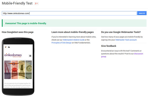
To aid people in understanding how it defines mobile-friendly, Google created a free Mobile-Friendly Test Tool. Enter a website URL into the address window, and after a few moments analysis the tool tells you if the site is mobile-friendly or not. If your site passes, great:
But if it doesn’t, what now?
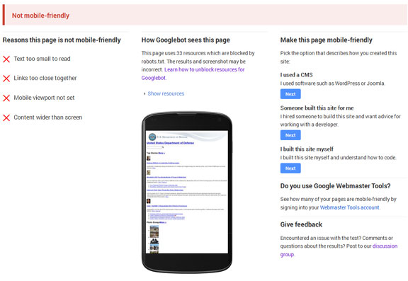
First, when you get a “not friendly” result, check the bottom of the middle column to see if there were load errors. A link allows you to show the resources that were not loaded (Note: we are showing results for the Department of Defense website):

All of these are .png images, so that probably does not affect our mobile layout directly. Otherwise it may be best to wait a few minutes and repeat the test.
Returning to the previous screen shot, right under the central column header “How Googlebot sees this page” we have an error telling us that some resources were blocked by robots.txt. The file robots.txt is typically installed in a website space to instruct search bots like Google on which pages NOT to index. In this case when we click the link we see the following:
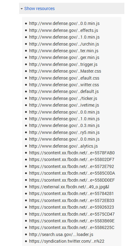
Part way down this listing, we can see that a few Cascading Style Sheet (.css) files were not accessed. This may be why the site appears the way it does in the mobile display (Tip: the way the DoD site appears in the mobile display is what a site usually looks like when the link to the style sheet is broken).
To “fix” the website, we may need to unblock some of the resources that the robots.txt file prevents Googlebot from accessing, and in any event we need to check into the resources that GoogleBot cannot access. Now let’s move to the specific issues listed under “Reasons this page is not mobile-friendly”. Here are the most common reason’s returned by the test, and what they may mean:
Text too small to read—The next screen shot shows what usually displays on a modern mobile device. The entire web page is squeezed by the mobile browser to fit on the device’s small screen:
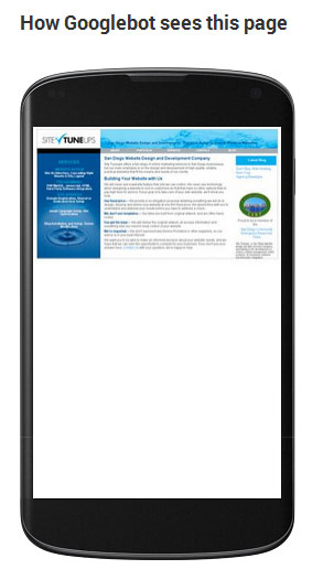
The text is far too small to read. On a responsive (mobile-friendly) site, the text will scale with its context, so it will still be legible on the small screen.
Links too close together—This is really the same issue as the text problem. On the small screen, the links for a non-friendly site are too close together to use. Mobile-friendly solutions for this vary, in most cases today when the screen width falls below a certain size, the main navigation is re-styled to roll out over the whole screen when the Visitor clicks on a icon.
Mobile viewport not set—Viewport is a meta-tag that sets the size of the viewing window for a web page. For mobile-friendly site, the viewport is set to be whatever width is offered by the device.
Content wider than screen—This can be tough to interpret unless we know whether or not Googlebot was able to download the style sheet. It typically means that some content container on the page was forced to a width in pixels that is larger than the pixel width (total resolution) of the device screen. So content flows off the page, and there is no way to see it without scrolling horizontally. It could be the whole page, or just one container that has an improperly set width.
The right column in the not friendly test results provides additional reading, depending on the origin of the site. This is very good material and recommended reading, but it does not really provide that much help in evaluating a website, nor does it cover all of the options that might exist. In my next two articles, I’ll try to do exactly that.
Still not sure that your website is mobile-friendly (or unfriendly)? Ask us! We’ll provide a complimentary site evaluation that goes past what the Google tool offers to provide you real insight into your website’s issues. We also offer guidance on what to do to make your site mobile-friendly. Find out more.